MICROVESA
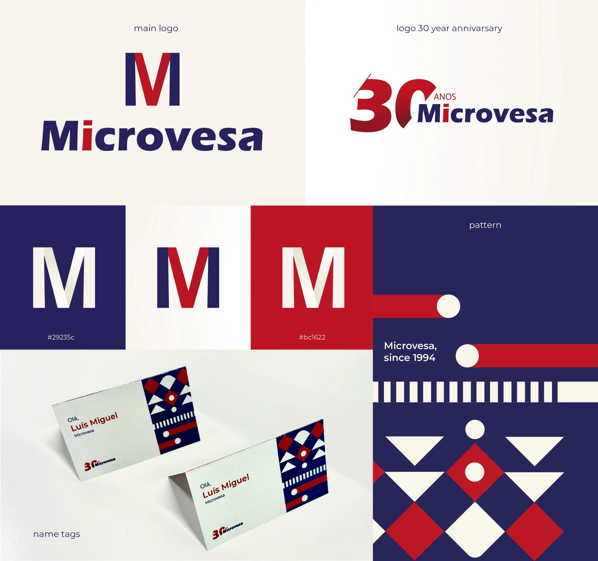
For Microvesa, a well-established IT company, I was tasked with updating its main logo to reflect a more modern aesthetic while preserving the essence of the brand. The project included creating a special logo to celebrate its 30th anniversary, as well as developing the visual identity for a commemorative event.
The new version of the logo features a refined and contemporary design, using a color palette of blue, red, and white. These colors not only represent the company’s established identity but also convey a sense of trust, innovation, and professionalism, aligning with Microvesa’s core values.
To celebrate Microvesa’s 30th anniversary, I created a commemorative logo that honors its three decades of excellence in the IT industry. This logo was designed to seamlessly integrate with the brand’s existing visual identity while also standing out as a symbol of this significant milestone.
For the anniversary celebration event, I developed identification cards for all participants.